Nederland (€)
 Europe (€)
 Deutschland (€)
 France (€)
 United Kingdom (£)
 United States ($)
 Schweiz (CHF)
A new look, the same tools
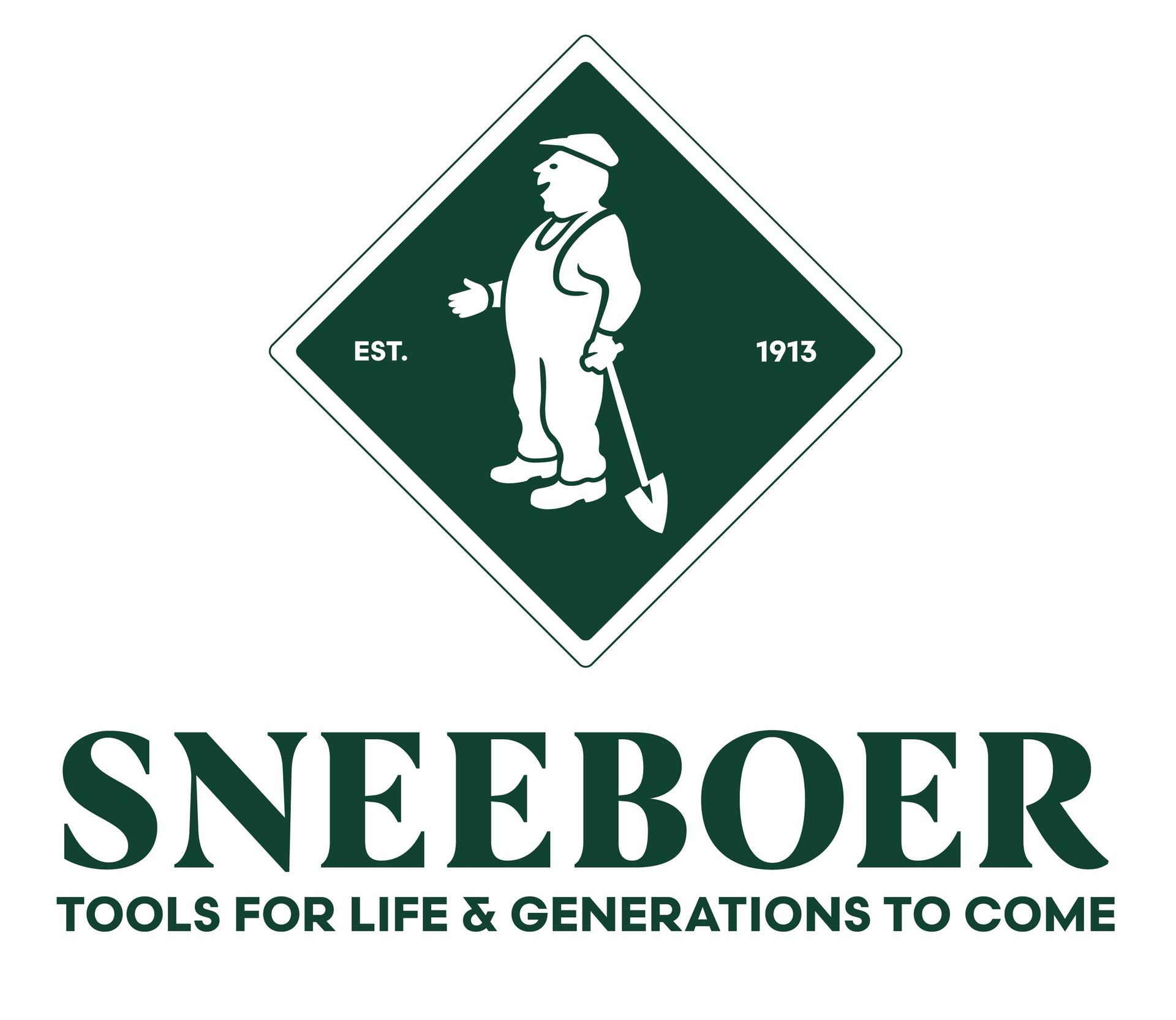
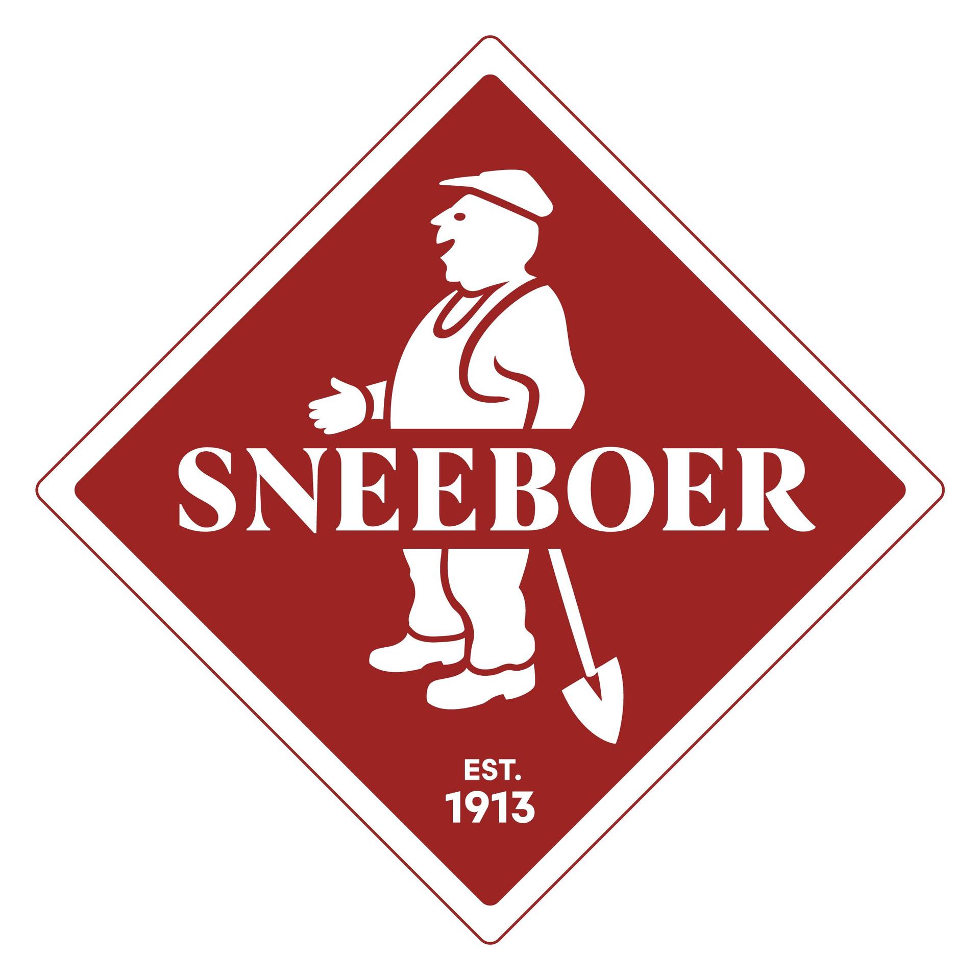
Since 1913, people in Bovenkarspel who are masters of their craft have been forging, shaping, and finishing products. That won’t change. What will change, however, is how we present ourselves. Sneeboer is getting a new corporate identity: a new logo, a different font, a new sticker, and a refreshed color palette.
The tools themselves remain the same. That’s by design. A new brand identity is no reason to change something that works well.
A Way of Working
Arie Sneeboer started out in 1913 with a blacksmith’s shop in a garden shed. Local gardeners and growers needed sturdy tools that would last, and Arie was convinced he could make them better than what was already available. His motto, “I know how to do it better,” has remained with the company ever since.
Today, the fourth generation works in the workshop. It’s not a business that’s been taken over, but a way of working. A way that isn’t about becoming faster, cheaper, or bigger than necessary, but about doing better. With every single tool, time and again.
A new generation is seeing that legacy with their own eyes. They’re asking questions about how we work, which techniques advance the craft, and how we communicate what we do. The new positioning is the result of that. It shows who Sneeboer is today, without losing sight of where it all began.
What’s Changing in the Workshop
The renewal goes beyond a logo. A lot has changed in the workshop in recent years.
Induction forging. For over a century, the metal was heated in a coal fire. Now it’s done using induction. An electromagnetic field heats the stainless steel from the inside out: the heat is generated within the metal itself. This process is fast and even; the temperature can be precisely controlled, and there is no burning or smoke involved. It’s better for the material, for the people in the workshop, and for the environment.
Laser cutting. Sheets and parts are cut from the plate using a laser. Every shape is precise from the start. As a result, the forging and finishing processes begin with a precise foundation, and each piece is identical to the previous one.
Laser welding. Joints are welded using a laser. This produces a narrow, strong weld with minimal heat around the joint. The surrounding stainless steel thus retains its properties, and the joint is tight and durable.
These techniques do not replace craftsmanship; they support it. Shaping the blade, grinding it, attaching the handle, and inspecting each piece are still done by hand. The oldest hammer in the workshop dates back to 1920 and is still in use today. Old and new methods work side by side here, each used where it works best.
What Remains the Same
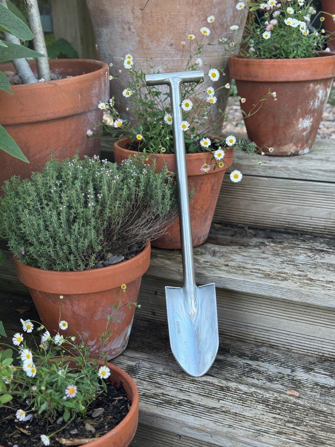
A Sneeboer shovel, trowel, or hoe is made from the same materials, with the same shapes, and the same attention to detail. Hand-forged stainless steel that doesn’t rust and stays sharp for years. An ash handle that is tough and resilient and fits comfortably in the hand. Tools with weight and balance, you can feel it in the resistance of the ground.
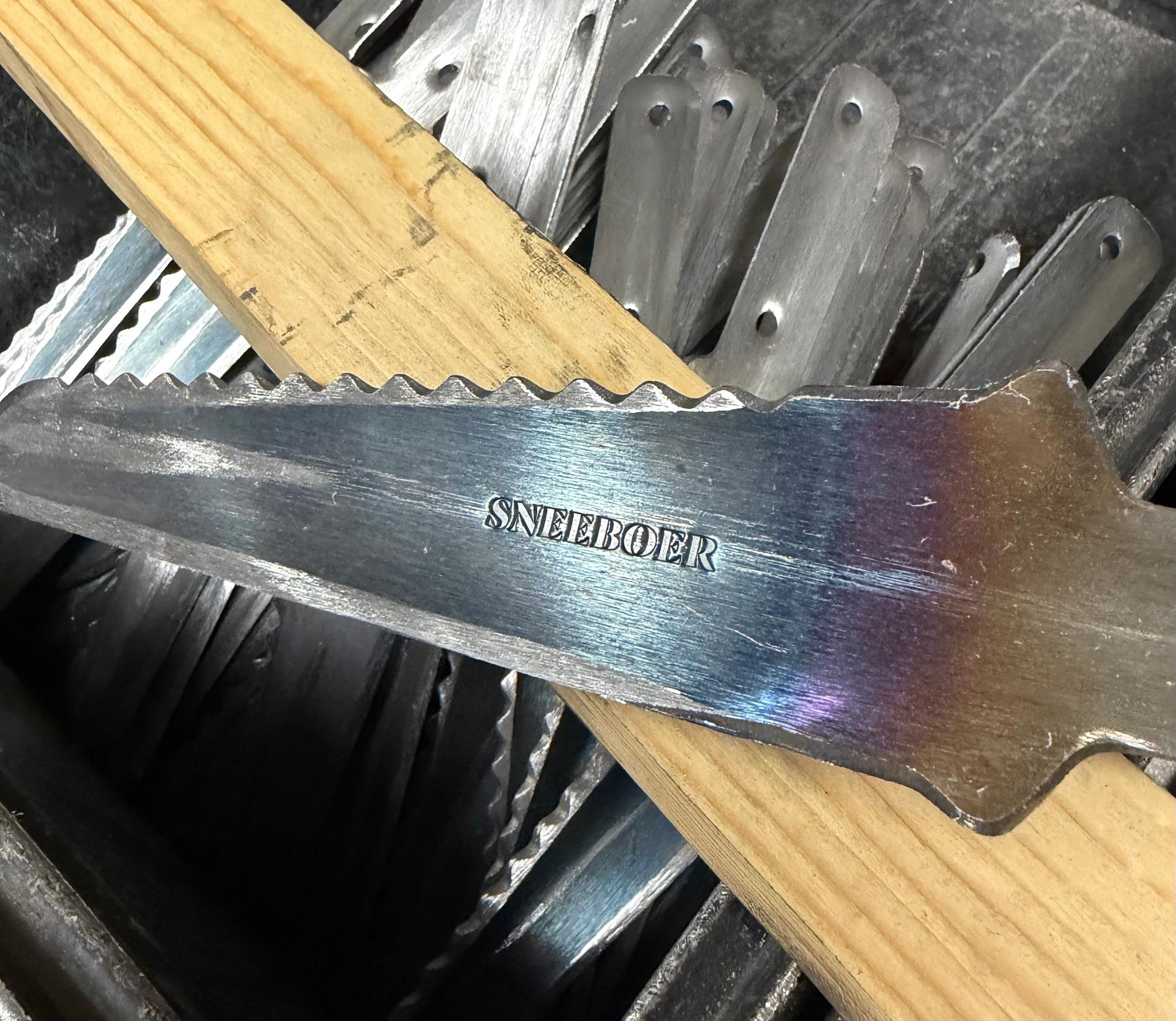
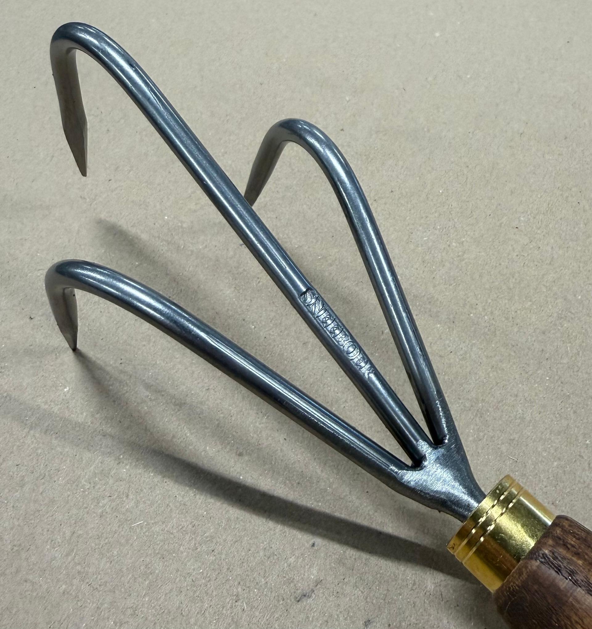
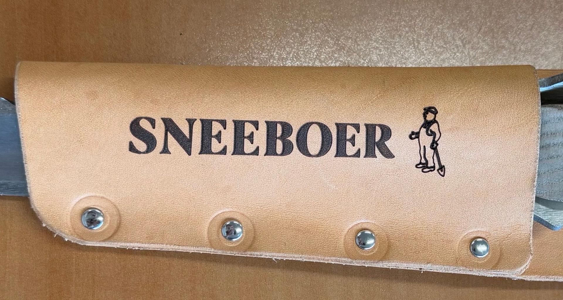
If you already have a Sneeboer hanging in your shed, there’s no need to replace anything. A 20-year-old trowel and a trowel from today are a perfect match. Only the logo has changed: on the sticker and in the logo we stamp into the stainless steel. The shape of the blade, the balance, and the quality remain the same.
The New Visual Identity
The new brand identity is built around what makes our tools unique and where they’re used. Every color has a story behind it.
Red. Our red has been updated: deeper and more subdued. It remains the color that identifies Sneeboer, in the workshop, in the store, and in the garden.
Ash wood. The warm, light hue of the handles. The material you touch every day, which only gets more beautiful with age.
Brass. The color of the details and the finish. A nod to the care taken in the small things, where quality often lies.
Coal black. For over a century, the coal fire burned in the forge. With the switch to induction, that fire has become history. The black preserves that history, serving as the foundation for everything that follows.
Garden green. The place where the tools do their work. The green connects the workshop to the garden: to the flower beds, vegetable gardens, and nurseries where Sneeboer is used every day.
In addition, a new typeface has been chosen: clear, easy to read, and free of unnecessary embellishments. The new logo, the sticker, and the die-cut mark follow the same design philosophy. Recognizable, simple, and built to last. Just like the tools.
The new style will be rolled out step by step in the coming period. You’ll see it on our website and in our communications, both online and offline. Administrative documents will also feature the new look, as will all other places where Sneeboer is visible. This way, everything that comes from us forms a single, recognizable whole.
Made for generations
Our promise remains the same: Tools for life, and generations to come. The new brand identity is not a break with the past. It is the next step in a story that began in a garden shed in 1913 and is being carried on today by the fourth generation.
What works stays. What can be improved is refined. That applies to our tools, to our workshop, and now also to how we present ourselves.
Anyone who has ever held a Sneeboer tool in their hands will recognize it immediately, even with a new logo.